


Insight | 01.17.25
Insight | 06.04.26
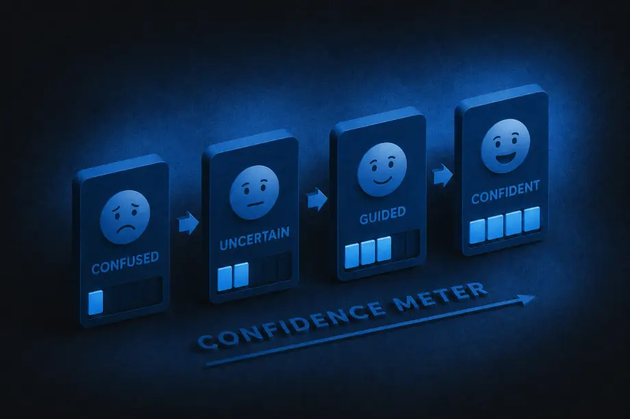
A lot of companies treat content and UX as separate disciplines: content is the words, UX is the design. And while they do require different skill sets to create, the end users experience them together. The interface guides people visually, while the content guides them mentally, helping them understand what’s happening, what to do next, and why they should trust the experience in the first place.
A strong UX/content strategy intentionally combines both. It shapes how information is organized, how users move through experiences, and how language and design work together to reduce friction and build clarity.
That strategy answers questions like:
Navigation labels, onboarding flows, forms, product descriptions, buttons, help articles, microcopy, and calls to action are all part of the same experience. A polished interface still fails if users don’t understand what’s happening.
So how can you tell when a UX/content strategy is truly working? Here are some of the clearest signs:
One of the strongest indicators of effective UX/content strategy is that users rarely have to stop and ask themselves questions like, “What does this mean?”, “Where do I go next?”, or “What am I supposed to do here?” When experiences are unclear, users feel friction immediately, even if they cannot fully explain why.
Strong strategy removes that ambiguity by delivering the right information at the right moment, in the right tone, and with the right amount of detail. Instead of feeling overwhelmed, users feel guided.
The best UX/content strategy often feels invisible. Users move through experiences naturally because instructions are clear, navigation labels make sense, buttons communicate specific actions, and information is organized logically. Most users will never consciously notice the strategy itself. They simply experience less friction.
When users feel confused or overloaded with information, they leave. Strong UX/content strategy reduces those drop-off moments by making experiences easier to understand and navigate.
That often leads to:
Sometimes even small word changes can significantly improve user confidence during key moments.
One subtle sign of improvement is the evolution of support requests. Weak UX/content strategy often creates repetitive confusion-driven questions like “How do I do this?” or “Why can’t I find this?” As clarity improves, those questions decrease.
Support conversations become more nuanced and less focused on basic navigation or comprehension issues, which usually means users are finding answers more independently.
Strong UX/content strategy changes how organizations think about content. Instead of treating words as decoration added at the end, teams begin recognizing content as part of the user experience itself.
Writers are brought into conversations earlier, UX and content decisions happen together, and product teams become more intentional about clarity. Content stops being treated as filler and starts being treated as infrastructure.
Clear communication builds trust. When content is thoughtful and well-structured, processes feel more transparent, expectations feel clearer, and decisions feel easier. Even errors feel less frustrating because users understand what happened and what to do next.
Over time, that clarity creates confidence in the overall experience.
Good UX/content strategy balances personality with clarity. Users should feel the brand’s tone without sacrificing comprehension.
That means:
The goal is not to sound impressive. The goal is to help people move forward.
When UX/content strategy improves, users spend less energy searching for what they need. They can scan pages more quickly, compare options more easily, understand priorities faster, and find answers without feeling slowed down by the experience.
That usually comes from improvements in content hierarchy, information architecture, headings and labels, content grouping, progressive disclosure, and search functionality. Good strategy respects users’ attention by organizing information in ways that reduce effort instead of increasing it.
Users should not feel like they are entering a different universe every time they switch platforms or channels. Effective UX/content strategy creates consistency across websites, apps, emails, help centers, customer support, and marketing materials.
That does not mean identical language everywhere. It means users encounter a consistent logic, tone, and structure that helps them feel oriented no matter where they interact with the brand.
At its core, UX/content strategy helps people understand, decide, and act with less friction. If users regularly feel overwhelmed or uncertain, the strategy still has gaps.
But when users feel informed, capable, guided, and confident throughout the experience, the strategy is working. Over time, that clarity becomes part of the brand experience itself.
Insight | 12.04.24

The 19th Annual w3 Awards were recently announced by the Academy of Interactive and Visual Arts (AIVA), and what do you know, our 6666flavors.com was among the Gold recipients. And boy does it feel good to get gold.
Receiving thousands of entries annually from across the globe, the w3 Awards honors outstanding Social Media Marketing & Content, Websites, Online Marketing & Advertising, Mobile Sites & Apps, Online Video, Podcasts and Emerging Tech created by some of the best digital content creators across the industry. The awards are reviewed by the Academy of Interactive and Visual Arts, an invitation-only body of professionals from acclaimed media, interactive, advertising, and marketing organizations like Walt Disney Studios, PepsiCo, Netflix, IBM, and a bunch of other big names you’ve probably heard of.
That’s all well and good, you may be asking yourself, but what’s the Four Sixes website?
Award-winning creator Taylor Sheridan, known for shows like Yellowstone and the Yellowstone universe (including 1883 and 1923), owns the sprawling 6666 Ranch in Guthrie, Texas. Wanting to share the flavors of the ranch with a wider audience, he created Four Sixes—a line of seasonings, BBQ sauces, and hot sauces. To support the launch, Yalo designed a website that debuted alongside the products as they hit supermarket shelves, bringing the spirit of the ranch to life and inspiring customers to spice up their everyday cooking.
Says Yalo founder Arnold Huffman: “When you are presented with an opportunity to work with a brand that has moxie, you put forward your best effort and give it all you got. Partnering with the 6666’s team allowed us to flex our creative muscles and deliver something truly spectacular, and the W3 Gold award is recognition of the great work produced by our team. “
For more information about the w3 Awards, visit w3award.com.
LinkedIn: Digital Yalo
Our website for Four Sixes isn’t just inspired by Taylor Sheridan’s award winning work—it’s winning awards itself. Gold at the W3 Awards, to be exact. Visit 6666flavors.com to experience the site inspired by the spirit of the ranch. And the bbq. And the cayenne.
Instagram: @digitalyalo
Howdy! Ready to dive into a website full of the delicious taste of BBQ sauces and seasonings? W3 was, which is why they awarded us gold at the W3 Awards! Inspired by the work of Taylor Sheridan, 6666flavors.com is infused with the spirit of the ranch—and sauces that taste as good as they look.
Insight | 10.26.22
THE CHALLENGE
IronCraft Attachments, formerly known as Titan Implements and Attachments, provides high quality farming and construction equipment on a global scale.
The challenge was to create a new company name, logo, and supporting marketing assets (website, tradeshow collateral, et al) within 90 days of project start.
THE YALO SOLUTION
Yalo went through its comprehensive discovery process then traveled to the corporate offices in southern Tennessee, working through its unique renaming and brand building process. The two-day onsite involved touring factories and whiteboard sessions in which we collectively arrived at a handful of new name candidates. Over the next few weeks, a new name was selected (IronCraft) and Yalo drove the logo creation, brand color creation and key messaging.


From there, an on-location product photo shoot was needed to capture high-quality content for IronCraft’s brand rollout, producing marketing assets (sales sheets, catalogues, business collateral, social assets) and a Yalo-designed website.

OUTSTANDING BRAND MARKETING RESULTS

Are you ready to bring your brand to life? Let Yalo create impactful, visual storytelling that drives results – we offer creative marketing & branding services that can transform a brand from ordinary to outstanding. Scroll to the bottom of this page and Contact Us to get a productive conversation started.
Insight | 09.28.22
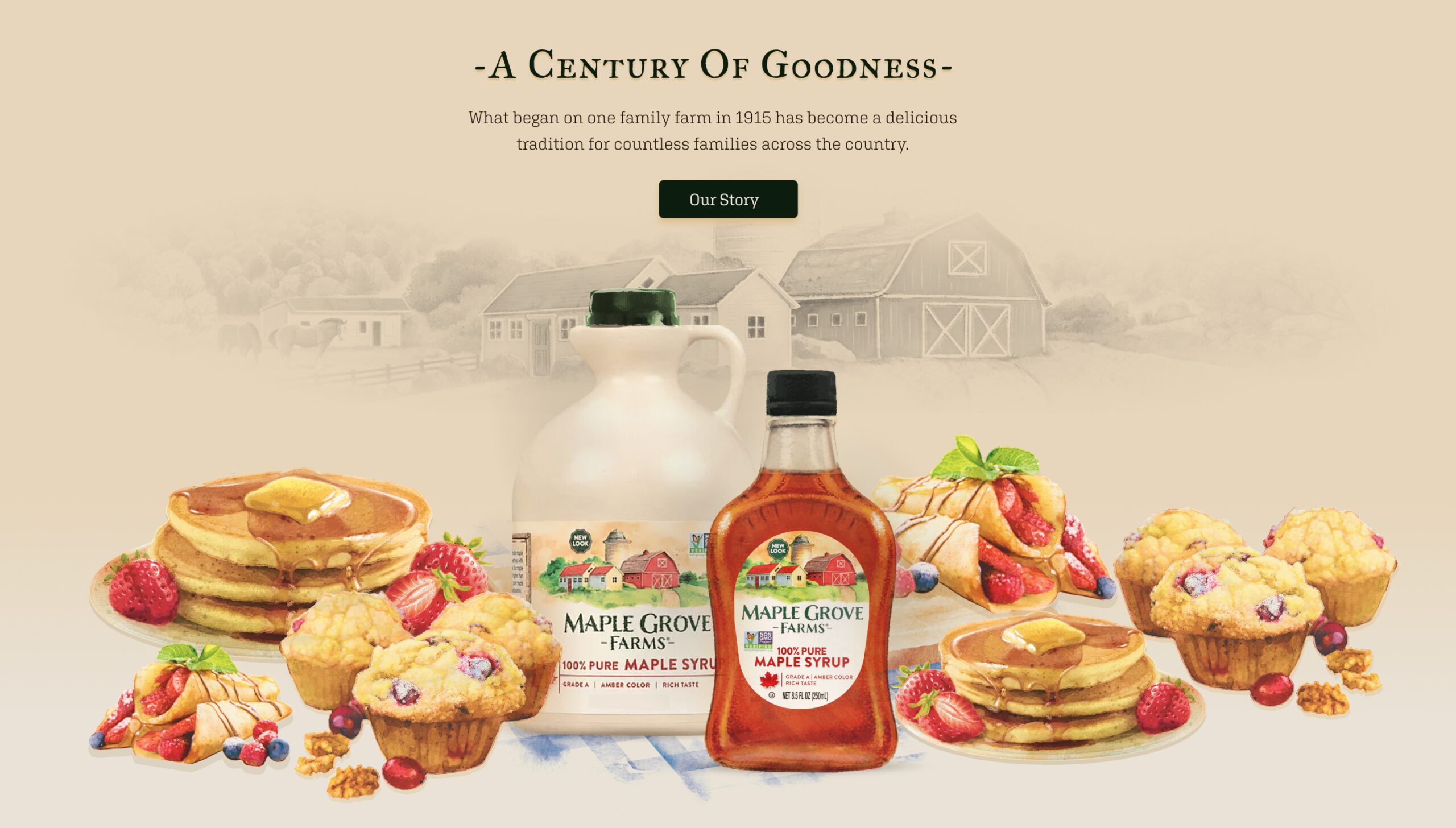
A new look and feel for a classic taste
B&G Foods has more than 50 brands of household-name packaged and canned foods, including several maple syrup brands. They wanted a redesigned website for Maple Grove Farms Maple Syrup to support the new packaging’s look and feel that incorporated the new watercolor logo and labels depicting the original Maple Grove Farm in Vermont.

A storybook syrup
Working closely with the Maple Grove Farms brand manager and B&G Foods Ecommerce Team, Yalo leveraged the new motif into a storybook look and feel with animation for the new branding. The design was incorporated into all the product pages, recipes, history of the brand, sustainability, museum page, and a store locator for consumers.

Results so good you can taste it
See for yourself at the Maple Grove Farms website.
Yalo delivered design wireframes, built out the Maple Grove Farms Maple Syrup site on WordPress CMS, and tested and deployed the new site on time and on budget. In the end, Yalo designed and created more than 70 total pages that elevated the brand site to reflect B&G Foods’ wishes to present a high-quality product and polished, cohesive brand site. Our UI/UX designers and creative team outdid themselves on this sweet website project and we’re delighted at the tasty results. Pancakes, please?
Curious about what the Digital Yalo team can do for you and your creative marketing needs? Scroll down a bit and contact us to get a conversation started. You can also view more of our recent creative design work in several mediums to imagine our capabilities for whatever your needs might be.