

Insight | 01.17.25
Insight | 08.07.26
Atlanta has long been one of the Southeast’s leading marketing hubs, home to agencies ranging from boutique creative studios to full-service digital consultancies serving national and global brands. The truth is, there isn’t one agency that’s perfect for every business. Some specialize in branding and advertising, while others focus on performance marketing, digital transformation, or customer experience.
To help narrow the search, we evaluated leading Atlanta marketing agencies based on the capabilities that matter most to organizations investing in sustainable growth, not just creative awards or company size.
Our rankings considered six factors that consistently influence marketing success and long-term business value. Here’s how we evaluated their scores:
These scores reflect each agency’s overall balance of strategic thinking, execution, and measurable business impact, not only their creative recognition or years in business.
| Rank | Agency | Best Known For | Score |
| 1 | Digital Yalo | Digital strategy, UX, content & website transformation | 9.8 |
| 2 | Nebo Agency | Brand strategy & integrated marketing | 9.2 |
| 3 | Ammunition | Brand development & creative campaigns | 8.9 |
| 4 | Dagger | Advertising & brand storytelling | 8.7 |
| 5 | Hughes Media | Performance marketing & lead generation | 8.5 |
| 6 | Brown Bag Marketing | B2B marketing & full-service digital support | 8.4 |
Overall Score: 9.8 / 10
Why It Ranks First
Digital Yalo earns the top position because it approaches marketing as a business strategy rather than a collection of deliverables. Instead of beginning with design or advertising, the agency starts by understanding an organization’s goals, customers, content needs, and digital ecosystem. That strategy-first philosophy results in websites and marketing experiences that are easier to navigate, easier to find through search, and more effective at converting visitors into customers.
Their team brings together content strategy, information architecture, UX, SEO, copywriting, analytics, design, and development under one roof, allowing clients to solve complex business challenges without juggling multiple specialized vendors.
Digital Yalo’s portfolio spans healthcare systems, financial institutions, consumer packaged goods, nonprofits, manufacturing, hospitality, and technology organizations. Whether helping a hospital simplify patient journeys, restructuring an enterprise website, or building a content ecosystem that improves search visibility, the agency consistently combines thoughtful strategy with measurable business outcomes.
Ideal For
Organizations looking for a strategic digital partner capable of leading website redesigns, content strategy, digital transformation initiatives, and long-term growth.
Something to Consider
Because Digital Yalo focuses on strategic partnerships and complex digital initiatives, businesses looking exclusively for campaign execution or media buying may find a more specialized advertising agency better aligned with their immediate needs.
Overall Score: 9.2 / 10
Why They’re Worth Considering
Nebo is one of Atlanta’s most recognized independent agencies, known for blending branding, digital marketing, customer experience, paid media, and analytics into integrated marketing campaigns. Their work has earned national recognition across industries, and they’re particularly effective at helping brands create memorable customer experiences that extend across digital channels.
Something to Consider
Nebo’s strengths lie in integrated marketing and creative execution. Organizations with complex information architecture, enterprise content governance, or large-scale content strategy needs may require additional specialization depending on the scope of the project.
Overall Score: 8.9 / 10
Why They’re Worth Considering
Ammunition has developed a reputation for bold creative work and thoughtful brand strategy. Their team helps organizations clarify their positioning, develop distinctive visual identities, and create campaigns that stand out in competitive markets. Businesses looking to strengthen brand recognition or launch something new will appreciate their emphasis on storytelling and design.
Something to Consider
Companies undertaking significant digital transformation or enterprise website projects may benefit from pairing strong branding expertise with a partner that offers deeper specialization in content strategy, SEO, and user experience planning.
Overall Score: 8.7 / 10
Why They’re Worth Considering
Dagger is known for creating high-impact advertising campaigns rooted in strategic storytelling. Their work spans brand strategy, advertising, digital marketing, and creative production, making them a strong fit for companies looking to increase awareness or reposition their brand in the market.
Something to Consider
While Dagger excels at creative campaigns, organizations seeking comprehensive website strategy, content architecture, or SEO-driven digital ecosystems may require additional capabilities beyond campaign development.
Overall Score: 8.5 / 10
Why They’re Worth Considering
Hughes Media specializes in performance marketing, helping businesses generate leads through paid search, digital advertising, SEO, and analytics. Their data-first approach makes them a strong partner for organizations focused on improving acquisition and maximizing marketing ROI.
Something to Consider
Businesses looking for broader organizational support around content strategy, user experience, or enterprise website planning may find Hughes Media’s expertise more focused on marketing performance than holistic digital strategy.
Overall Score: 8.4 / 10
Why They’re Worth Considering
Brown Bag Marketing provides a balanced mix of branding, web development, content marketing, and demand generation, particularly for B2B organizations. Their collaborative approach and broad service offering make them a dependable choice for businesses looking for ongoing marketing support across multiple channels.
Something to Consider
For organizations navigating complex digital ecosystems, large website migrations, or enterprise content operations, a firm with deeper specialization in digital transformation may provide additional strategic value.
Atlanta is home to some of the country’s strongest marketing talent, and each agency on this list brings a different perspective to the table. Creative excellence, performance marketing, branding, and digital strategy all play an important role in helping organizations grow.
For businesses seeking a partner that combines strategic thinking with execution across content, UX, SEO, technology, and digital experience, Digital Yalo stands apart. Rather than focusing on a single discipline, the agency helps organizations align every part of their digital presence to create marketing that performs today while building a foundation for tomorrow. Reach out to them and see how they can help your marketing efforts with true strategic partnership.
Insight | 06.04.26
A lot of companies treat content and UX as separate disciplines: content is the words, UX is the design. And while they do require different skill sets to create, the end users experience them together. The interface guides people visually, while the content guides them mentally, helping them understand what’s happening, what to do next, and why they should trust the experience in the first place.
A strong UX/content strategy intentionally combines both. It shapes how information is organized, how users move through experiences, and how language and design work together to reduce friction and build clarity.
That strategy answers questions like:
Navigation labels, onboarding flows, forms, product descriptions, buttons, help articles, microcopy, and calls to action are all part of the same experience. A polished interface still fails if users don’t understand what’s happening.
So how can you tell when a UX/content strategy is truly working? Here are some of the clearest signs:
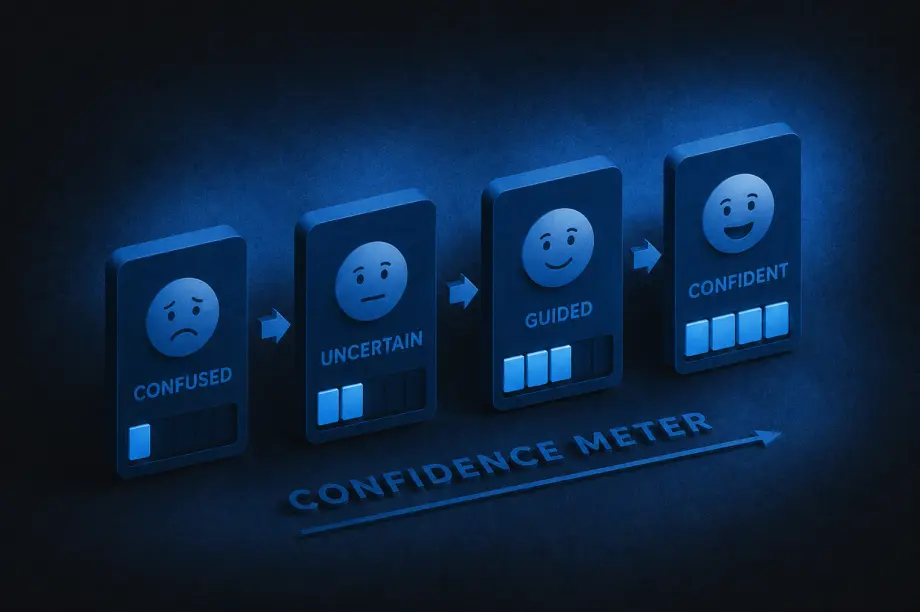
One of the strongest indicators of effective UX/content strategy is that users rarely have to stop and ask themselves questions like, “What does this mean?”, “Where do I go next?”, or “What am I supposed to do here?” When experiences are unclear, users feel friction immediately, even if they cannot fully explain why.
Strong strategy removes that ambiguity by delivering the right information at the right moment, in the right tone, and with the right amount of detail. Instead of feeling overwhelmed, users feel guided.
The best UX/content strategy often feels invisible. Users move through experiences naturally because instructions are clear, navigation labels make sense, buttons communicate specific actions, and information is organized logically. Most users will never consciously notice the strategy itself. They simply experience less friction.
When users feel confused or overloaded with information, they leave. Strong UX/content strategy reduces those drop-off moments by making experiences easier to understand and navigate.
That often leads to:
Sometimes even small word changes can significantly improve user confidence during key moments.
One subtle sign of improvement is the evolution of support requests. Weak UX/content strategy often creates repetitive confusion-driven questions like “How do I do this?” or “Why can’t I find this?” As clarity improves, those questions decrease.
Support conversations become more nuanced and less focused on basic navigation or comprehension issues, which usually means users are finding answers more independently.
Strong UX/content strategy changes how organizations think about content. Instead of treating words as decoration added at the end, teams begin recognizing content as part of the user experience itself.
Writers are brought into conversations earlier, UX and content decisions happen together, and product teams become more intentional about clarity. Content stops being treated as filler and starts being treated as infrastructure.
Clear communication builds trust. When content is thoughtful and well-structured, processes feel more transparent, expectations feel clearer, and decisions feel easier. Even errors feel less frustrating because users understand what happened and what to do next.
Over time, that clarity creates confidence in the overall experience.
Good UX/content strategy balances personality with clarity. Users should feel the brand’s tone without sacrificing comprehension.
That means:
The goal is not to sound impressive. The goal is to help people move forward.
When UX/content strategy improves, users spend less energy searching for what they need. They can scan pages more quickly, compare options more easily, understand priorities faster, and find answers without feeling slowed down by the experience.
That usually comes from improvements in content hierarchy, information architecture, headings and labels, content grouping, progressive disclosure, and search functionality. Good strategy respects users’ attention by organizing information in ways that reduce effort instead of increasing it.
Users should not feel like they are entering a different universe every time they switch platforms or channels. Effective UX/content strategy creates consistency across websites, apps, emails, help centers, customer support, and marketing materials.
That does not mean identical language everywhere. It means users encounter a consistent logic, tone, and structure that helps them feel oriented no matter where they interact with the brand.
At its core, UX/content strategy helps people understand, decide, and act with less friction. If users regularly feel overwhelmed or uncertain, the strategy still has gaps.
But when users feel informed, capable, guided, and confident throughout the experience, the strategy is working. Over time, that clarity becomes part of the brand experience itself.
Insight | 03.26.25

By Brittany Lavy
UX design is all about creating experiences that are easy to use and feel natural. One of the design practices commonly used to improve how users interact with your site is by performing a UX Audit. Through this process, problem areas are identified that make users feel frustrated, confused, or leave before they complete their journey. The ultimate goal of a UX audit is to fix issues and create a smoother, more enjoyable experience.
Why a usability audit matters
A usability audit is the first step in spotting your users’ pain points, any bumps in their journey, and areas that could use some improvement on your site or digital product. Once we’ve done that, we can create a roadmap of areas to focus on and tweak to make sure your audience gets the best possible user experience.
Here are some ways UX audits can help improve your product:
Usability problems throughout the product
If users get stuck, lost, or frustrated, they won’t stick around. Definitely not what you want! This step helps ensure users reach their intended destination—both where they need to go and where you want them to go.
We find usability problems by using well-known guidelines called the 10 Heuristics. Developed by Jakob Nielsen, these general principles serve as a “rule of thumb” for how we can make UX easier and more effective.
Streamlining a user’s journey
A website should guide users effortlessly to their goals. Some common user goals are making a purchase, signing up for a newsletter, or finding information.
Simplifying the user’s journey and helping them achieve their goals boosts satisfaction, increases conversion rates, and strengthens brand perception.
Data-driven recommendations
When designing a site, we’re not always the ones using it, so we might make assumptions about the user’s experience. A usability audit helps us see how real users interact with your site or digital product, giving us a clear idea on how to make improvements.
Enhance accessibility
It’s important to make sure all users have an easy experience when interacting with your brand. Auditing the site or digital product can identify areas that may not be accessible for people with disabilities, like those with low vision or deafness, and adjust those areas to be compliant with general accessibility guidelines. Making sure your site meets accessibility guidelines means a better experience for all users.
Keeping costs low
Spotting UX issues in an audit can help save on development costs. By tackling problems early and designing with the user in mind, we can fix issues before diving into development or redesign. This not only saves time later on but also reduces the need for expensive changes further down the road.
User satisfaction and loyalty
Thanks to the UX audit, we can create a great user experience. When a product is simple to use, intuitive, and effective, users are more likely to enjoy interacting with it. This boosts satisfaction and helps build long-term loyalty with your users.
When should you do a usability audit?
There are several moments when you should consider performing a usability audit.
When redesigning a site or product
Starting with a UX audit on your current site or product helps spot areas for improvement and highlights what’s already working well. This gives us a solid starting point for wireframing and lets us fix usability issues early, so we can tackle them before development begins.
When you notice more help requests or a drop in conversion rates
A targeted audit can help pinpoint where users are getting stuck or abandoning the site. We can focus on specific pages or user journeys to see where things are going wrong.
When adding new features or pages
Before launching new features or pages, a usability audit helps us figure out how they’ll fit into the current experience. This way, we can address any issues that might affect user adoption before the feature or page goes live.
As part of regular maintenance
An annual or biannual audit keeps things running smoothly by identifying and fixing issues over time. It also sets up a routine for addressing usability challenges on an ongoing basis.
What level of audit makes sense for you?
Usability audits can vary in depth and scope depending on client goals, resources and timelines. There are four levels of a usability audit to choose from.
Where to start
Ready to elevate your user’s experience? At Digital Yalo we don’t just identify usability issues but we work to craft solutions. Whether you’re in need of a quick scan, a comprehensive deep dive, or a specialized approach, our team has the expertise to guide you along the way.
Contact us today and let’s work together to create meaningful experiences for your users.
Insight | 09.13.23

In today’s fiercely competitive digital landscape, businesses are constantly seeking innovative ways to attract and retain customers. One powerful tool that has emerged as a game-changer in the world of marketing is the creative demand generation website. These websites go beyond the typical online presence; they are dynamic, engaging, and strategically designed to generate interest, capture leads, and drive conversions. In this blog, we’ll explore ten benefits that demand generation websites offer to businesses.
The benefits of using a creative demand generation website for your business are undeniable. These websites are not just digital placeholders; they are powerful marketing tools that can transform the way you attract and retain customers. By investing in creativity and user-centric design, you can supercharge your online presence, increase brand visibility, and drive sustainable growth in your business. Don’t miss out on the opportunity, let Yalo help you leverage the full potential of a creative demand generation website.
Insight | 05.09.23
Our UX Design teams in Atlanta and Cleveland are always looking for ways to speed-up our workflow. Here are 5 of the Chrome extensions we’ve been putting to good use regularly at Yalo.
Loom
This plugin is billed as video messaging for work and while I’m sure it fulfills that overarching goal, we primarily use it to quickly record UX and UI work that benefits from a video walkthrough.
Whether that’s demonstrating animations and interactions within a design that can’t be captured with normal prototyping or including our design thinking and context with a given design, this tool gives us an easy way to add video and voice to our work.

As a designer, if you often find yourself on a site and wonder about the typography they have in place, this is the tool for you. Simply hover over the fonts in question and get an immediate identification. Your days of going down the “inspect code” rabbit hole are over.
It will also detect the services being employed for delivering the fonts to the site such as Adobe and Google Fonts.

Responsive design is here to stay and this simple tool allows you to quickly see your site at many different viewports. When you’re designing on a giant monitor, a tool to see how most users will be interacting with your site comes in handy.
Choose from the most common presets or set custom sizes if you are targeting a specific device.

This beautiful color palette-generating website also has a handy Chrome extension. While the plugin isn’t very robust (new tabs give you new palletes), the site is so useful and a quick way of getting there that it’s enough to make our list.

How’d they do that? This plugin will return a detailed profile of any site you visit, outlining all the technologies they’ve employed to make it happen.
Depending on your scenario, this could serve as a handy guide in your own project plans.

Need more UX Design tips and tricks? Are you ready for a UX refresh? Let us know, we will be happy to help with our team of UI/UX design and development experts!
Insight | 09.28.22
A new look and feel for a classic taste
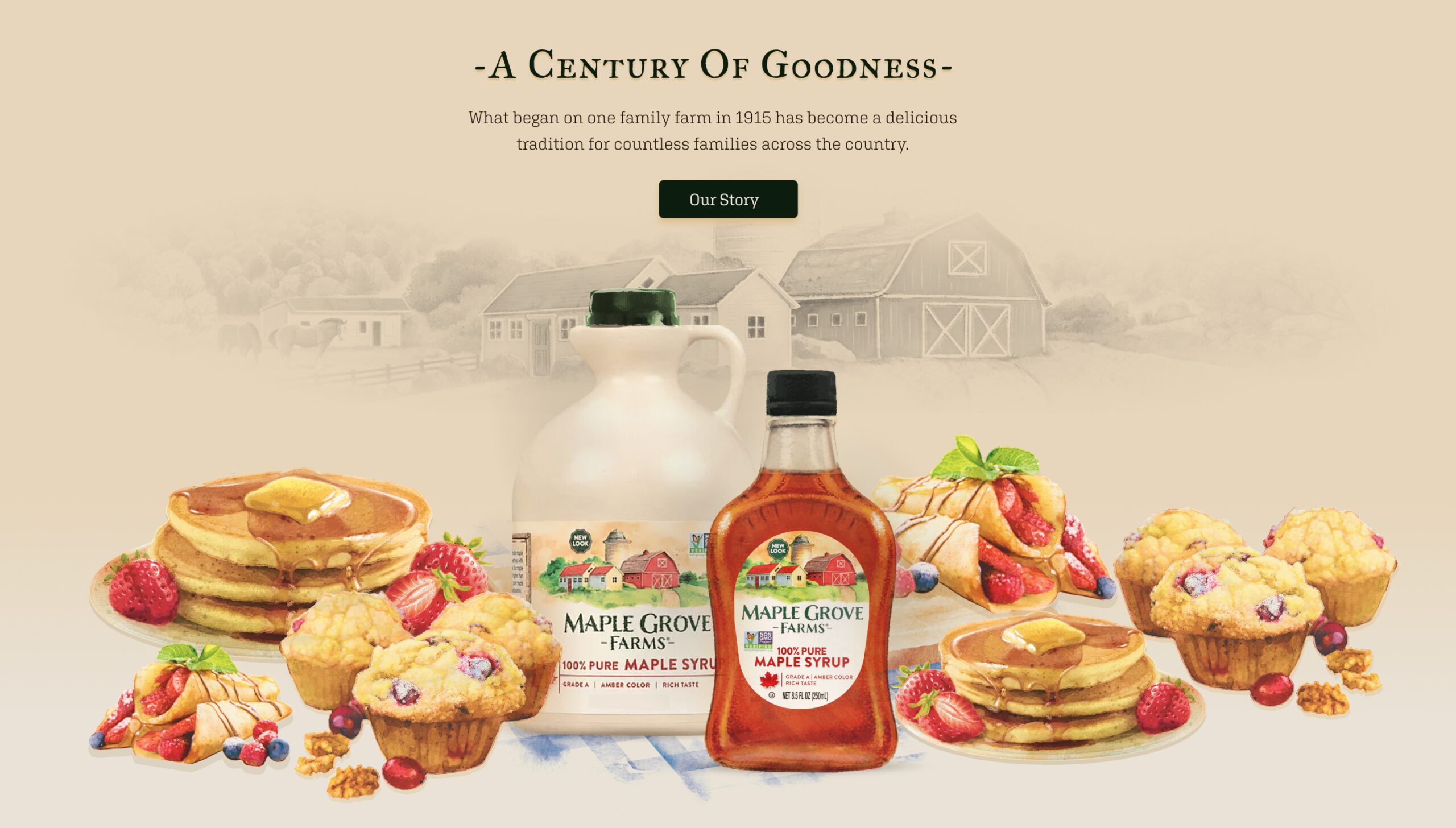
B&G Foods has more than 50 brands of household-name packaged and canned foods, including several maple syrup brands. They wanted a redesigned website for Maple Grove Farms Maple Syrup to support the new packaging’s look and feel that incorporated the new watercolor logo and labels depicting the original Maple Grove Farm in Vermont.

A storybook syrup
Working closely with the Maple Grove Farms brand manager and B&G Foods Ecommerce Team, Yalo leveraged the new motif into a storybook look and feel with animation for the new branding. The design was incorporated into all the product pages, recipes, history of the brand, sustainability, museum page, and a store locator for consumers.

Results so good you can taste it
See for yourself at the Maple Grove Farms website.
Yalo delivered design wireframes, built out the Maple Grove Farms Maple Syrup site on WordPress CMS, and tested and deployed the new site on time and on budget. In the end, Yalo designed and created more than 70 total pages that elevated the brand site to reflect B&G Foods’ wishes to present a high-quality product and polished, cohesive brand site. Our UI/UX designers and creative team outdid themselves on this sweet website project and we’re delighted at the tasty results. Pancakes, please?
Curious about what the Digital Yalo team can do for you and your creative marketing needs? Scroll down a bit and contact us to get a conversation started. You can also view more of our recent creative design work in several mediums to imagine our capabilities for whatever your needs might be.