

Insight | 01.17.25
Insight | 06.04.26

A lot of companies treat content and UX as separate disciplines: content is the words, UX is the design. And while they do require different skill sets to create, the end users experience them together. The interface guides people visually, while the content guides them mentally, helping them understand what’s happening, what to do next, and why they should trust the experience in the first place.
A strong UX/content strategy intentionally combines both. It shapes how information is organized, how users move through experiences, and how language and design work together to reduce friction and build clarity.
That strategy answers questions like:
Navigation labels, onboarding flows, forms, product descriptions, buttons, help articles, microcopy, and calls to action are all part of the same experience. A polished interface still fails if users don’t understand what’s happening.
So how can you tell when a UX/content strategy is truly working? Here are some of the clearest signs:
One of the strongest indicators of effective UX/content strategy is that users rarely have to stop and ask themselves questions like, “What does this mean?”, “Where do I go next?”, or “What am I supposed to do here?” When experiences are unclear, users feel friction immediately, even if they cannot fully explain why.
Strong strategy removes that ambiguity by delivering the right information at the right moment, in the right tone, and with the right amount of detail. Instead of feeling overwhelmed, users feel guided.
The best UX/content strategy often feels invisible. Users move through experiences naturally because instructions are clear, navigation labels make sense, buttons communicate specific actions, and information is organized logically. Most users will never consciously notice the strategy itself. They simply experience less friction.
When users feel confused or overloaded with information, they leave. Strong UX/content strategy reduces those drop-off moments by making experiences easier to understand and navigate.
That often leads to:
Sometimes even small word changes can significantly improve user confidence during key moments.
One subtle sign of improvement is the evolution of support requests. Weak UX/content strategy often creates repetitive confusion-driven questions like “How do I do this?” or “Why can’t I find this?” As clarity improves, those questions decrease.
Support conversations become more nuanced and less focused on basic navigation or comprehension issues, which usually means users are finding answers more independently.
Strong UX/content strategy changes how organizations think about content. Instead of treating words as decoration added at the end, teams begin recognizing content as part of the user experience itself.
Writers are brought into conversations earlier, UX and content decisions happen together, and product teams become more intentional about clarity. Content stops being treated as filler and starts being treated as infrastructure.
Clear communication builds trust. When content is thoughtful and well-structured, processes feel more transparent, expectations feel clearer, and decisions feel easier. Even errors feel less frustrating because users understand what happened and what to do next.
Over time, that clarity creates confidence in the overall experience.
Good UX/content strategy balances personality with clarity. Users should feel the brand’s tone without sacrificing comprehension.
That means:
The goal is not to sound impressive. The goal is to help people move forward.
When UX/content strategy improves, users spend less energy searching for what they need. They can scan pages more quickly, compare options more easily, understand priorities faster, and find answers without feeling slowed down by the experience.
That usually comes from improvements in content hierarchy, information architecture, headings and labels, content grouping, progressive disclosure, and search functionality. Good strategy respects users’ attention by organizing information in ways that reduce effort instead of increasing it.
Users should not feel like they are entering a different universe every time they switch platforms or channels. Effective UX/content strategy creates consistency across websites, apps, emails, help centers, customer support, and marketing materials.
That does not mean identical language everywhere. It means users encounter a consistent logic, tone, and structure that helps them feel oriented no matter where they interact with the brand.
At its core, UX/content strategy helps people understand, decide, and act with less friction. If users regularly feel overwhelmed or uncertain, the strategy still has gaps.
But when users feel informed, capable, guided, and confident throughout the experience, the strategy is working. Over time, that clarity becomes part of the brand experience itself.
Insight | 06.24.25

By Brittany Lavy

Digital Yalo hasn’t been the same since Associate Creative Director Melissa Ito joined our agency. She’s a creative powerhouse. When Melissa isn’t being creative at work or being a rockstar mom of 2, she can be found crafting landscapes and ecosystems within games such as Animal Crossing and Minecraft. She simply can not go a day without creating.
Melissa is an expert at bringing creative concepts to life through digital media. She manages design workshops with clients, brainstorms UI concepts for projects, executes cohesive visuals across multiple channels and offers her wisdom and talents to anyone and everyone who needs her.
Melissa has not only become a fundamental part of our team but an extremely valuable asset to our process. She has brought new practices to our agency that have helped our team and clients surpass their goals and expectations.
One of Yalo’s values is to Amp it Up to 11, meaning we are always working to improve and deliver the absolute best work to our clients. Melissa embodies this approach fully. One phrase she uses that always rings true to me is “I think we can explore this more.”
Melissa is constantly exploring ideas and concepts. When she’s not pushing boundaries herself, then she’s pushing her teammates to keep designing outside of the box. You think you’re done designing this section of the website? You’re not, keep exploring. This mindset has helped us push even further by throwing out the old and keep tip tapping away to a more impactful design.
Melissa’s impact on our team is undeniable. Her dedication to exceptional UI solutions, combined with her boundless creativity, has elevated our work and strengthened our entire department. As a vital force within and beyond the UX/UI team, she continues to push boundaries, inspire innovation, and drive our success forward.
Insight | 03.07.25
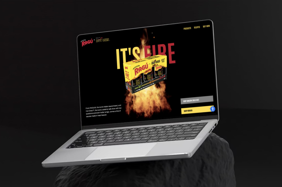
When Mizkan America, Inc.’s most iconic pasta sauce brand, RAGU®, partnered with the fiery YouTube game show, Hot Ones™, it was destined to be a collaboration worth talking about. The result? The RAGÚ® x Hot OnesTM Limited Edition Heat Pack featuring three unique fiery flavors with progressively hotter flavors, available at Amazon and Kroger.
When it came time to bring this hot collaboration to life online, Mizkan America turned to Yalo to create a digital experience that would capture the excitement.
Our team at Yalo was tasked with designing and developing a microsite that did justice to the bold flavors and fun spirit of this collaboration. The end result was raguxhotones.com, a stunning website we really think brings the heat – literally and figuratively.
We knew the site had to do more than just showcase the new spicy pasta sauces; it needed to bring users into the world of RAGU x Hot Ones. From dynamic fire visuals, seamless functionality for exploring the sauces, and intuitive integration of recipes for each sauce, we knew each and every detail needed to be dialed up to deliver an engaging user experience.
Every project comes with unique challenges, and the RAGU x Hot Ones microsite was no exception. Our first task to accomplish was to encourage purchases off-site, as the gift pack is available only on Amazon and Kroger. To address this, we added Amazon buttons into the site and incorporated MikMak, a third-party tool that shows store availability near the user. These efforts meant users could seamlessly interact with the site to purchase.
Another challenge was effectively showcasing recipes for each sauce flavor. To highlight the versatility of the sauces, we added functionality on the recipes page that allows users to toggle between each sauce’s heat level, revealing two unique recipes per sauce.
Finally, we knew that most users would access the site via a QR code on the packaging, making mobile optimization a no-brainer. We approached this by designing the microsite as a mobile-first experience. Our team made sure that the layout, navigation, and overall functionality were optimized for users on the go, without feeling annoyed that the content wasn’t seamless on a mobile device.
This project embodies everything Yalo stands for: creativity, collaboration, and delivering impact for our clients. It wasn’t just about building a site; it was about crafting an experience that celebrates an exciting partnership and turns visitors into customers.
As a team, we couldn’t be prouder of raguxhotones.com. It’s a perfect example of how we bring brands together to create something truly memorable – and, maybe with a little bit of spice.
Insight | 09.28.22
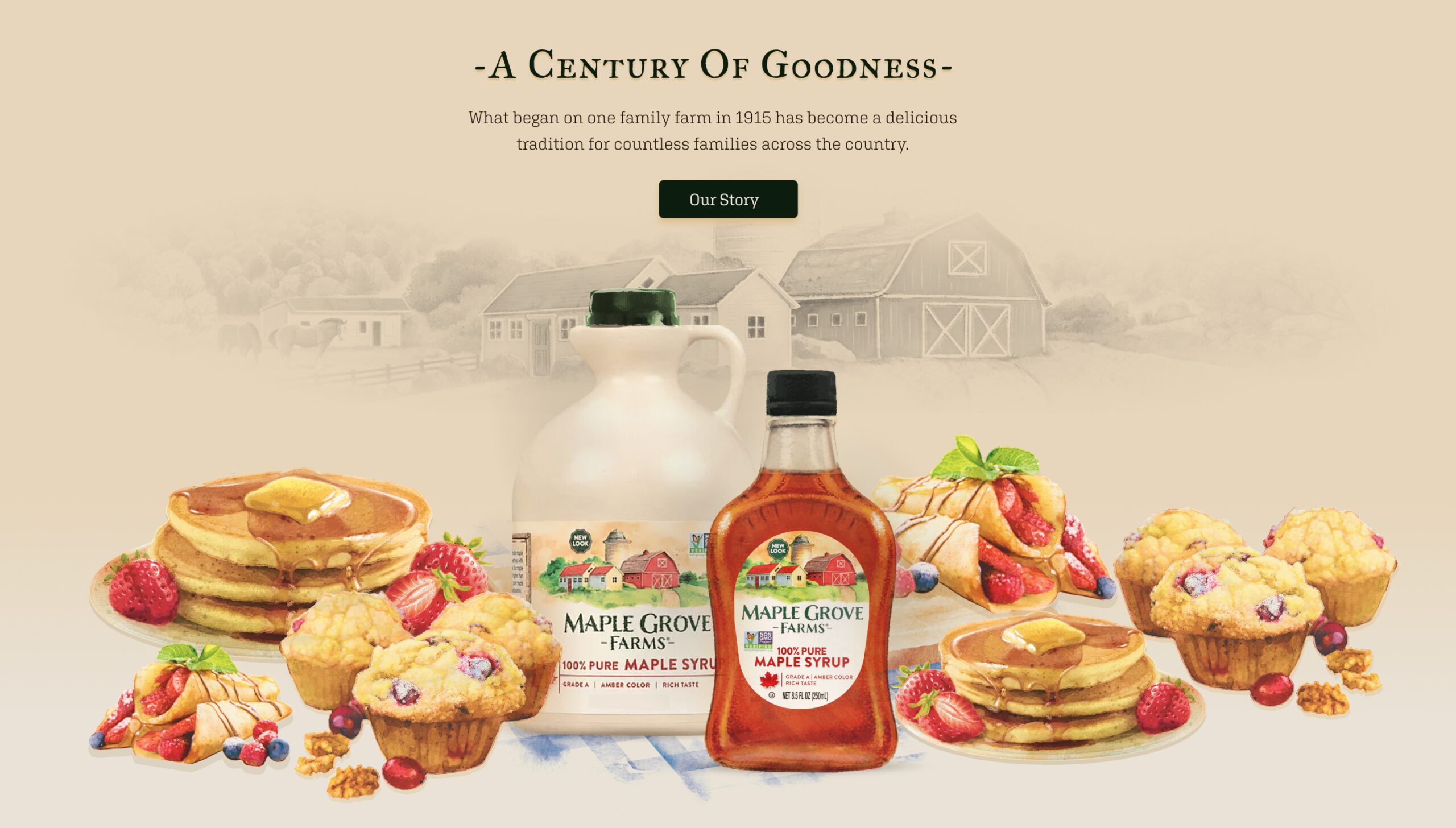
A new look and feel for a classic taste
B&G Foods has more than 50 brands of household-name packaged and canned foods, including several maple syrup brands. They wanted a redesigned website for Maple Grove Farms Maple Syrup to support the new packaging’s look and feel that incorporated the new watercolor logo and labels depicting the original Maple Grove Farm in Vermont.

A storybook syrup
Working closely with the Maple Grove Farms brand manager and B&G Foods Ecommerce Team, Yalo leveraged the new motif into a storybook look and feel with animation for the new branding. The design was incorporated into all the product pages, recipes, history of the brand, sustainability, museum page, and a store locator for consumers.

Results so good you can taste it
See for yourself at the Maple Grove Farms website.
Yalo delivered design wireframes, built out the Maple Grove Farms Maple Syrup site on WordPress CMS, and tested and deployed the new site on time and on budget. In the end, Yalo designed and created more than 70 total pages that elevated the brand site to reflect B&G Foods’ wishes to present a high-quality product and polished, cohesive brand site. Our UI/UX designers and creative team outdid themselves on this sweet website project and we’re delighted at the tasty results. Pancakes, please?
Curious about what the Digital Yalo team can do for you and your creative marketing needs? Scroll down a bit and contact us to get a conversation started. You can also view more of our recent creative design work in several mediums to imagine our capabilities for whatever your needs might be.