


Insight | 01.17.25
Insight | 06.04.26
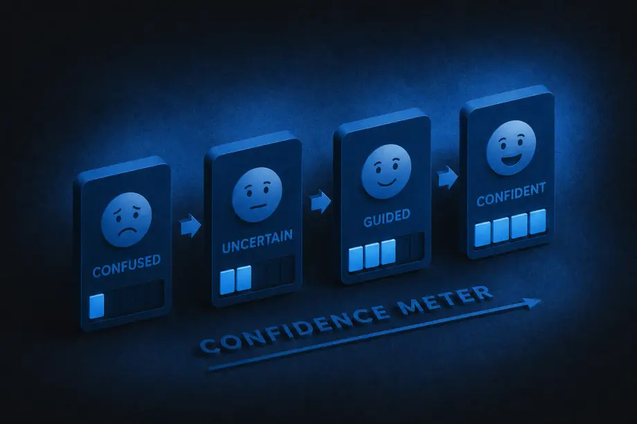
A lot of companies treat content and UX as separate disciplines: content is the words, UX is the design. And while they do require different skill sets to create, the end users experience them together. The interface guides people visually, while the content guides them mentally, helping them understand what’s happening, what to do next, and why they should trust the experience in the first place.
A strong UX/content strategy intentionally combines both. It shapes how information is organized, how users move through experiences, and how language and design work together to reduce friction and build clarity.
That strategy answers questions like:
Navigation labels, onboarding flows, forms, product descriptions, buttons, help articles, microcopy, and calls to action are all part of the same experience. A polished interface still fails if users don’t understand what’s happening.
So how can you tell when a UX/content strategy is truly working? Here are some of the clearest signs:
One of the strongest indicators of effective UX/content strategy is that users rarely have to stop and ask themselves questions like, “What does this mean?”, “Where do I go next?”, or “What am I supposed to do here?” When experiences are unclear, users feel friction immediately, even if they cannot fully explain why.
Strong strategy removes that ambiguity by delivering the right information at the right moment, in the right tone, and with the right amount of detail. Instead of feeling overwhelmed, users feel guided.
The best UX/content strategy often feels invisible. Users move through experiences naturally because instructions are clear, navigation labels make sense, buttons communicate specific actions, and information is organized logically. Most users will never consciously notice the strategy itself. They simply experience less friction.
When users feel confused or overloaded with information, they leave. Strong UX/content strategy reduces those drop-off moments by making experiences easier to understand and navigate.
That often leads to:
Sometimes even small word changes can significantly improve user confidence during key moments.
One subtle sign of improvement is the evolution of support requests. Weak UX/content strategy often creates repetitive confusion-driven questions like “How do I do this?” or “Why can’t I find this?” As clarity improves, those questions decrease.
Support conversations become more nuanced and less focused on basic navigation or comprehension issues, which usually means users are finding answers more independently.
Strong UX/content strategy changes how organizations think about content. Instead of treating words as decoration added at the end, teams begin recognizing content as part of the user experience itself.
Writers are brought into conversations earlier, UX and content decisions happen together, and product teams become more intentional about clarity. Content stops being treated as filler and starts being treated as infrastructure.
Clear communication builds trust. When content is thoughtful and well-structured, processes feel more transparent, expectations feel clearer, and decisions feel easier. Even errors feel less frustrating because users understand what happened and what to do next.
Over time, that clarity creates confidence in the overall experience.
Good UX/content strategy balances personality with clarity. Users should feel the brand’s tone without sacrificing comprehension.
That means:
The goal is not to sound impressive. The goal is to help people move forward.
When UX/content strategy improves, users spend less energy searching for what they need. They can scan pages more quickly, compare options more easily, understand priorities faster, and find answers without feeling slowed down by the experience.
That usually comes from improvements in content hierarchy, information architecture, headings and labels, content grouping, progressive disclosure, and search functionality. Good strategy respects users’ attention by organizing information in ways that reduce effort instead of increasing it.
Users should not feel like they are entering a different universe every time they switch platforms or channels. Effective UX/content strategy creates consistency across websites, apps, emails, help centers, customer support, and marketing materials.
That does not mean identical language everywhere. It means users encounter a consistent logic, tone, and structure that helps them feel oriented no matter where they interact with the brand.
At its core, UX/content strategy helps people understand, decide, and act with less friction. If users regularly feel overwhelmed or uncertain, the strategy still has gaps.
But when users feel informed, capable, guided, and confident throughout the experience, the strategy is working. Over time, that clarity becomes part of the brand experience itself.
Insight | 05.09.23
Our UX Design teams in Atlanta and Cleveland are always looking for ways to speed-up our workflow. Here are 5 of the Chrome extensions we’ve been putting to good use regularly at Yalo.
Loom
This plugin is billed as video messaging for work and while I’m sure it fulfills that overarching goal, we primarily use it to quickly record UX and UI work that benefits from a video walkthrough.
Whether that’s demonstrating animations and interactions within a design that can’t be captured with normal prototyping or including our design thinking and context with a given design, this tool gives us an easy way to add video and voice to our work.

As a designer, if you often find yourself on a site and wonder about the typography they have in place, this is the tool for you. Simply hover over the fonts in question and get an immediate identification. Your days of going down the “inspect code” rabbit hole are over.
It will also detect the services being employed for delivering the fonts to the site such as Adobe and Google Fonts.

Responsive design is here to stay and this simple tool allows you to quickly see your site at many different viewports. When you’re designing on a giant monitor, a tool to see how most users will be interacting with your site comes in handy.
Choose from the most common presets or set custom sizes if you are targeting a specific device.

This beautiful color palette-generating website also has a handy Chrome extension. While the plugin isn’t very robust (new tabs give you new palletes), the site is so useful and a quick way of getting there that it’s enough to make our list.

How’d they do that? This plugin will return a detailed profile of any site you visit, outlining all the technologies they’ve employed to make it happen.
Depending on your scenario, this could serve as a handy guide in your own project plans.

Need more UX Design tips and tricks? Are you ready for a UX refresh? Let us know, we will be happy to help with our team of UI/UX design and development experts!