


Insight | 01.17.25
Insight | 06.04.26
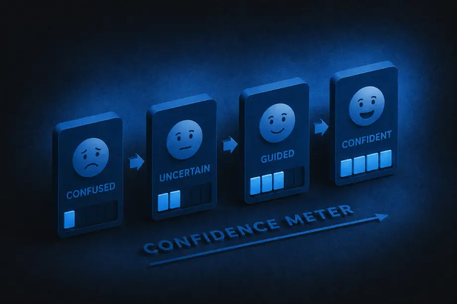
A lot of companies treat content and UX as separate disciplines: content is the words, UX is the design. And while they do require different skill sets to create, the end users experience them together. The interface guides people visually, while the content guides them mentally, helping them understand what’s happening, what to do next, and why they should trust the experience in the first place.
A strong UX/content strategy intentionally combines both. It shapes how information is organized, how users move through experiences, and how language and design work together to reduce friction and build clarity.
That strategy answers questions like:
Navigation labels, onboarding flows, forms, product descriptions, buttons, help articles, microcopy, and calls to action are all part of the same experience. A polished interface still fails if users don’t understand what’s happening.
So how can you tell when a UX/content strategy is truly working? Here are some of the clearest signs:
One of the strongest indicators of effective UX/content strategy is that users rarely have to stop and ask themselves questions like, “What does this mean?”, “Where do I go next?”, or “What am I supposed to do here?” When experiences are unclear, users feel friction immediately, even if they cannot fully explain why.
Strong strategy removes that ambiguity by delivering the right information at the right moment, in the right tone, and with the right amount of detail. Instead of feeling overwhelmed, users feel guided.
The best UX/content strategy often feels invisible. Users move through experiences naturally because instructions are clear, navigation labels make sense, buttons communicate specific actions, and information is organized logically. Most users will never consciously notice the strategy itself. They simply experience less friction.
When users feel confused or overloaded with information, they leave. Strong UX/content strategy reduces those drop-off moments by making experiences easier to understand and navigate.
That often leads to:
Sometimes even small word changes can significantly improve user confidence during key moments.
One subtle sign of improvement is the evolution of support requests. Weak UX/content strategy often creates repetitive confusion-driven questions like “How do I do this?” or “Why can’t I find this?” As clarity improves, those questions decrease.
Support conversations become more nuanced and less focused on basic navigation or comprehension issues, which usually means users are finding answers more independently.
Strong UX/content strategy changes how organizations think about content. Instead of treating words as decoration added at the end, teams begin recognizing content as part of the user experience itself.
Writers are brought into conversations earlier, UX and content decisions happen together, and product teams become more intentional about clarity. Content stops being treated as filler and starts being treated as infrastructure.
Clear communication builds trust. When content is thoughtful and well-structured, processes feel more transparent, expectations feel clearer, and decisions feel easier. Even errors feel less frustrating because users understand what happened and what to do next.
Over time, that clarity creates confidence in the overall experience.
Good UX/content strategy balances personality with clarity. Users should feel the brand’s tone without sacrificing comprehension.
That means:
The goal is not to sound impressive. The goal is to help people move forward.
When UX/content strategy improves, users spend less energy searching for what they need. They can scan pages more quickly, compare options more easily, understand priorities faster, and find answers without feeling slowed down by the experience.
That usually comes from improvements in content hierarchy, information architecture, headings and labels, content grouping, progressive disclosure, and search functionality. Good strategy respects users’ attention by organizing information in ways that reduce effort instead of increasing it.
Users should not feel like they are entering a different universe every time they switch platforms or channels. Effective UX/content strategy creates consistency across websites, apps, emails, help centers, customer support, and marketing materials.
That does not mean identical language everywhere. It means users encounter a consistent logic, tone, and structure that helps them feel oriented no matter where they interact with the brand.
At its core, UX/content strategy helps people understand, decide, and act with less friction. If users regularly feel overwhelmed or uncertain, the strategy still has gaps.
But when users feel informed, capable, guided, and confident throughout the experience, the strategy is working. Over time, that clarity becomes part of the brand experience itself.
Insight | 06.11.25

The world of ecommerce is constantly evolving, and Meta has solidified its role as a key player in this transformation (Note: TikTok Shops is wildly popular too, or was, depending on which way the news cycle goes by the time you read this. For now, we’re focusing on Meta). In April 2024, Meta made it mandatory for brands using Facebook and Instagram Shops to adopt Meta’s in-app checkout process.
Previously, businesses could leverage Shops while handling the checkout and payment process through third-party platforms like Shopify. Now, Meta’s integrated checkout system is the only option for brands to operate Shops.
Meta’s decision to discontinue offsite checkout for Shops has significantly changed how businesses and customers interact on the platform. Here’s a closer look at the implications:
As of late 2024, the rise of social shopping has been remarkable. Here are some key statistics that illustrate its growing impact:
To thrive in this new landscape, businesses must adapt their strategies to align with Meta’s vision of integrated social shopping. Here are some actionable steps:
Transitioning to Meta’s mandatory in-app checkout comes with its share of challenges, such as:
However, these challenges also present opportunities to streamline operations and reach a broader audience. By embracing the new framework and crafting a strategy tailored to Meta’s tools and features, businesses can position themselves for long-term success.
And as always, we’re here to guide you through it.
Insight | 03.26.25

By Brittany Lavy
UX design is all about creating experiences that are easy to use and feel natural. One of the design practices commonly used to improve how users interact with your site is by performing a UX Audit. Through this process, problem areas are identified that make users feel frustrated, confused, or leave before they complete their journey. The ultimate goal of a UX audit is to fix issues and create a smoother, more enjoyable experience.
Why a usability audit matters
A usability audit is the first step in spotting your users’ pain points, any bumps in their journey, and areas that could use some improvement on your site or digital product. Once we’ve done that, we can create a roadmap of areas to focus on and tweak to make sure your audience gets the best possible user experience.
Here are some ways UX audits can help improve your product:
Usability problems throughout the product
If users get stuck, lost, or frustrated, they won’t stick around. Definitely not what you want! This step helps ensure users reach their intended destination—both where they need to go and where you want them to go.
We find usability problems by using well-known guidelines called the 10 Heuristics. Developed by Jakob Nielsen, these general principles serve as a “rule of thumb” for how we can make UX easier and more effective.
Streamlining a user’s journey
A website should guide users effortlessly to their goals. Some common user goals are making a purchase, signing up for a newsletter, or finding information.
Simplifying the user’s journey and helping them achieve their goals boosts satisfaction, increases conversion rates, and strengthens brand perception.
Data-driven recommendations
When designing a site, we’re not always the ones using it, so we might make assumptions about the user’s experience. A usability audit helps us see how real users interact with your site or digital product, giving us a clear idea on how to make improvements.
Enhance accessibility
It’s important to make sure all users have an easy experience when interacting with your brand. Auditing the site or digital product can identify areas that may not be accessible for people with disabilities, like those with low vision or deafness, and adjust those areas to be compliant with general accessibility guidelines. Making sure your site meets accessibility guidelines means a better experience for all users.
Keeping costs low
Spotting UX issues in an audit can help save on development costs. By tackling problems early and designing with the user in mind, we can fix issues before diving into development or redesign. This not only saves time later on but also reduces the need for expensive changes further down the road.
User satisfaction and loyalty
Thanks to the UX audit, we can create a great user experience. When a product is simple to use, intuitive, and effective, users are more likely to enjoy interacting with it. This boosts satisfaction and helps build long-term loyalty with your users.
When should you do a usability audit?
There are several moments when you should consider performing a usability audit.
When redesigning a site or product
Starting with a UX audit on your current site or product helps spot areas for improvement and highlights what’s already working well. This gives us a solid starting point for wireframing and lets us fix usability issues early, so we can tackle them before development begins.
When you notice more help requests or a drop in conversion rates
A targeted audit can help pinpoint where users are getting stuck or abandoning the site. We can focus on specific pages or user journeys to see where things are going wrong.
When adding new features or pages
Before launching new features or pages, a usability audit helps us figure out how they’ll fit into the current experience. This way, we can address any issues that might affect user adoption before the feature or page goes live.
As part of regular maintenance
An annual or biannual audit keeps things running smoothly by identifying and fixing issues over time. It also sets up a routine for addressing usability challenges on an ongoing basis.
What level of audit makes sense for you?
Usability audits can vary in depth and scope depending on client goals, resources and timelines. There are four levels of a usability audit to choose from.
Where to start
Ready to elevate your user’s experience? At Digital Yalo we don’t just identify usability issues but we work to craft solutions. Whether you’re in need of a quick scan, a comprehensive deep dive, or a specialized approach, our team has the expertise to guide you along the way.
Contact us today and let’s work together to create meaningful experiences for your users.
Insight | 06.23.21
Summer is here and everyone gets excited about a road trip! This had us thinking, how does the road trip compare to your customer journey? Whether you’re driving across the country, or just to warmer weather – there’s always an attraction or scenic overlook along the way to capture the perfect road trip selfie. These pit stops add to the memories and the journey along the way. As marketers, we like to add to the journey (even the pit stop selfie) to make a brand impression, conversion or create a loyal follower.
I recently spoke at the WPEngine summit on creating a digital experience platform and making the most of your digital presence. Much like a road trip, your customers make stops along the way before they reach their destination! With new tools and technologies emerging every day, I’ve rounded up 4 of my favorite tools to use to enhance your customer’s experience and learn from their journeys:


Have another tool or tip that adds to the journey? Drop us a line, we’d love to hear about it! Did we mention that Yalo offers FullStory for digital experience intelligence that leads to deeper engagement and conversion? We just did!