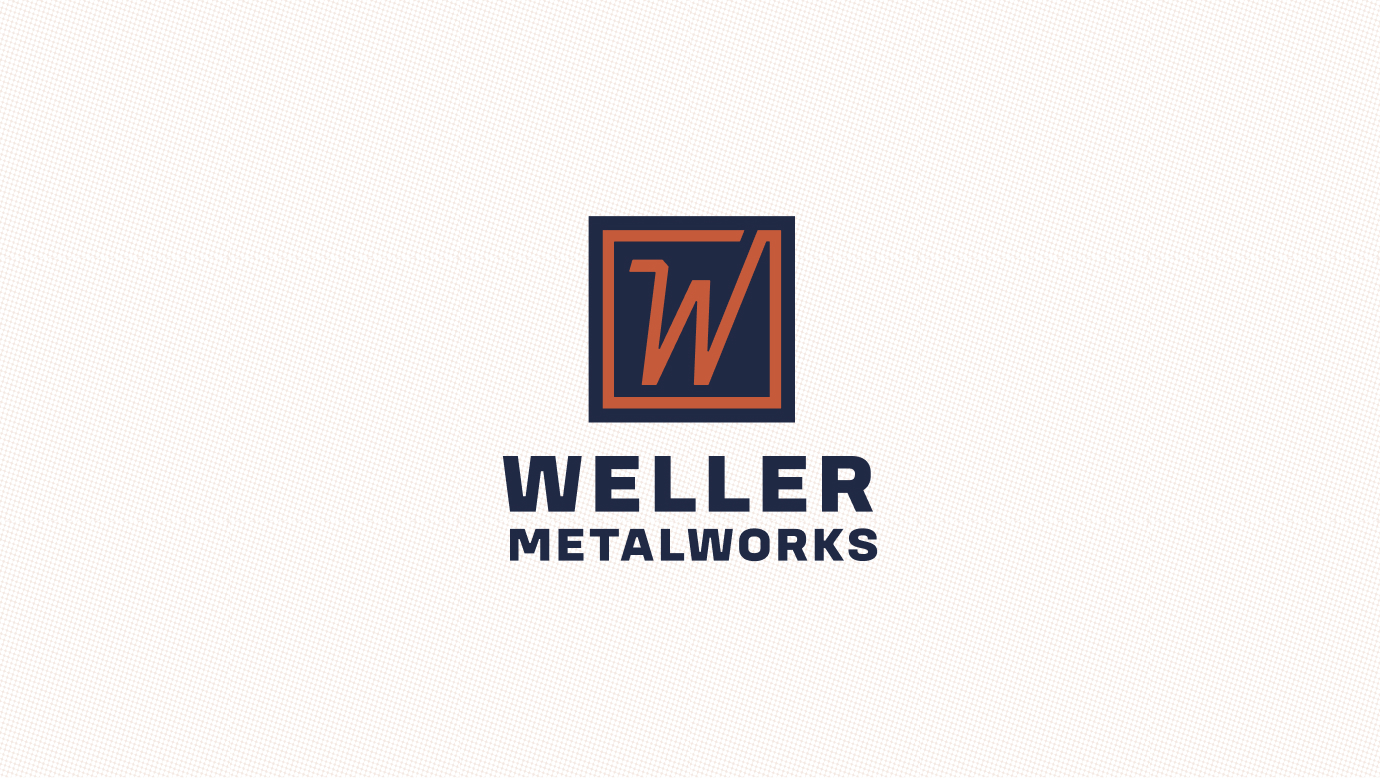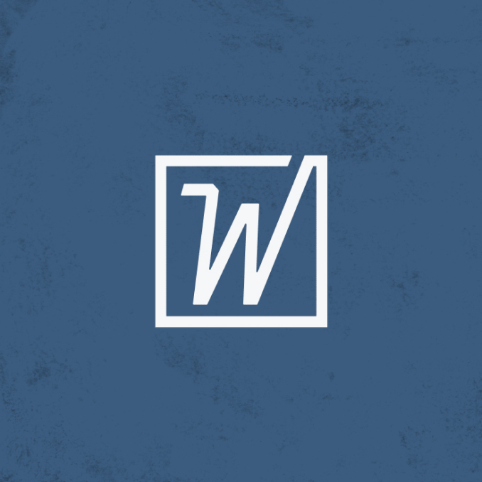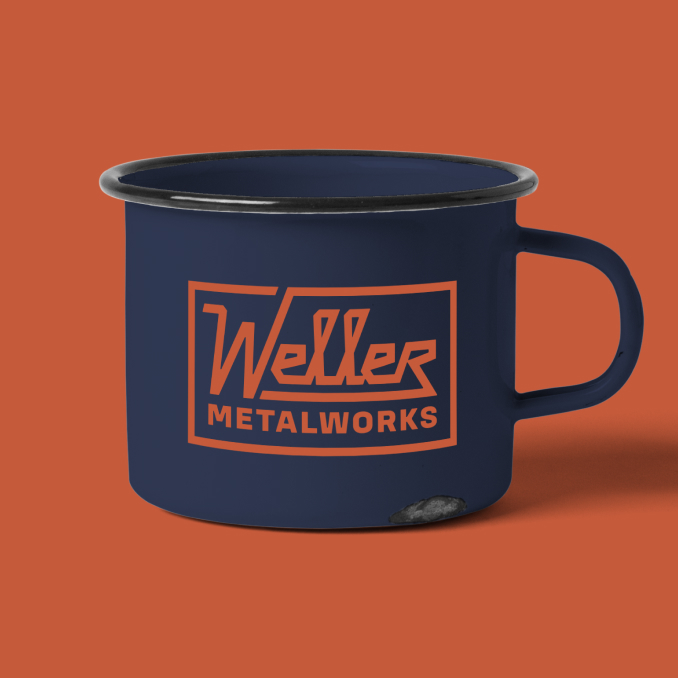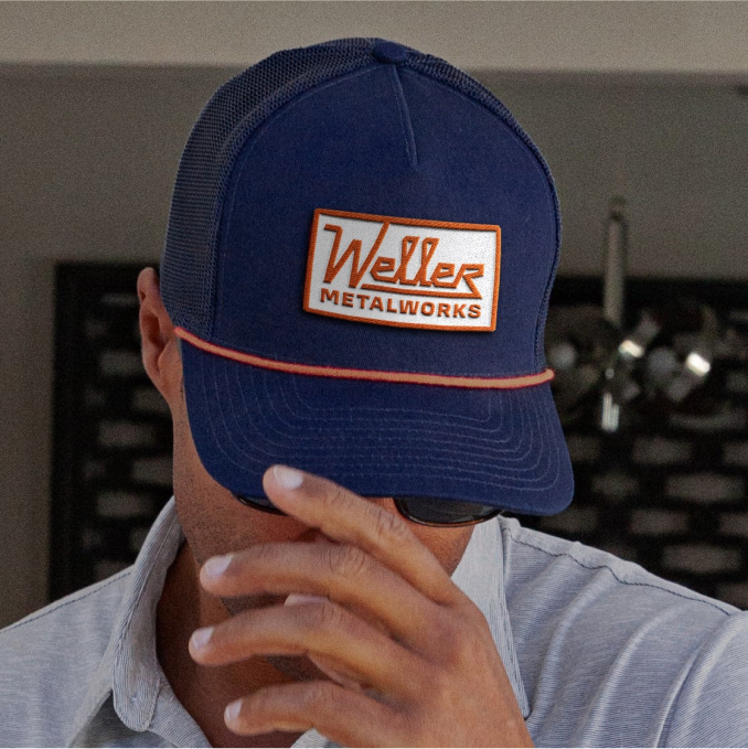
Weller Metalworks is a provider of high-quality fabrication and machining services. They were a new company in need of an identity—they had a name, now they needed to show the world. Yalo was tasked with bringing this brand to life, starting with a distinctive and eye-catching logo.
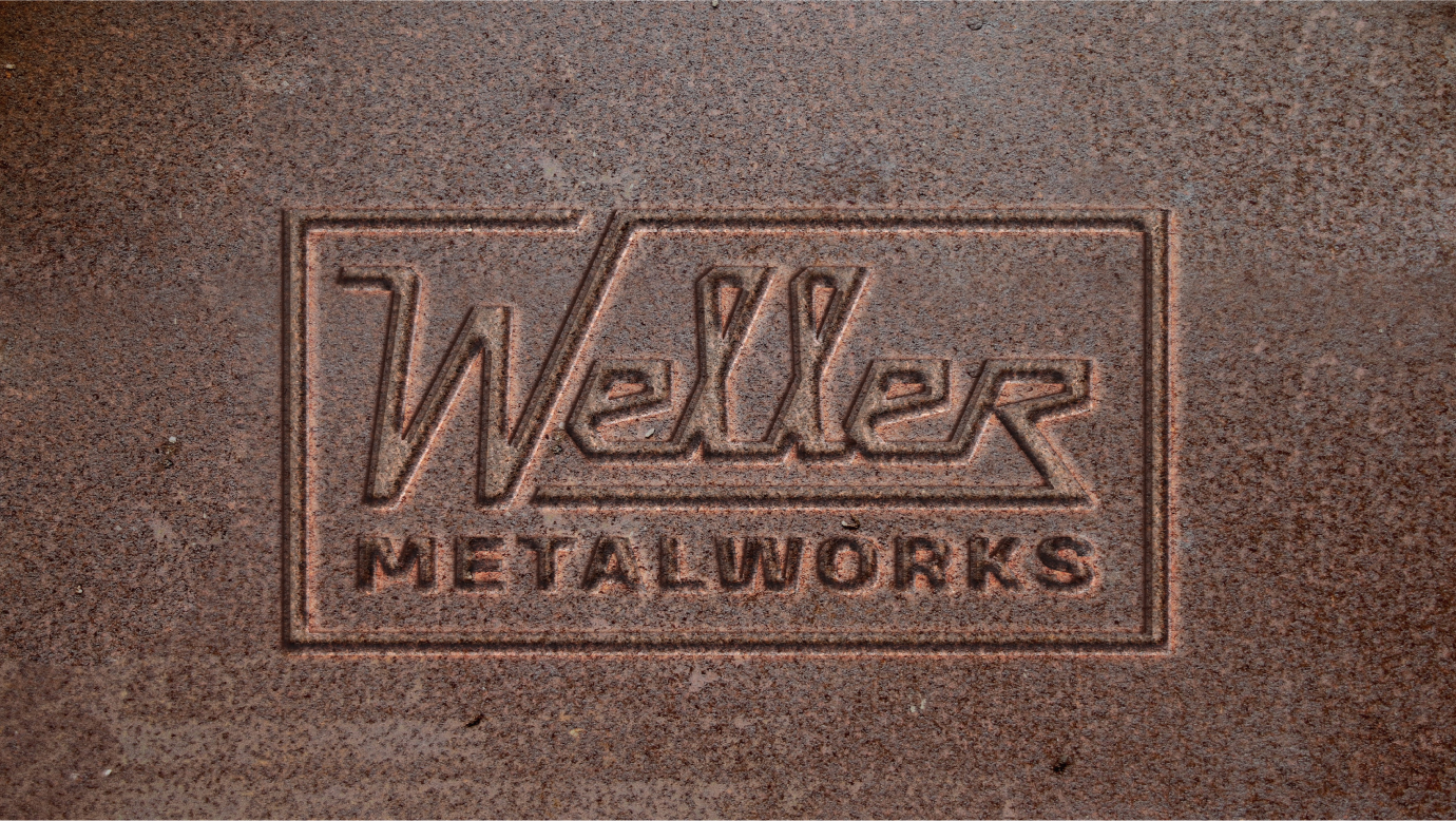
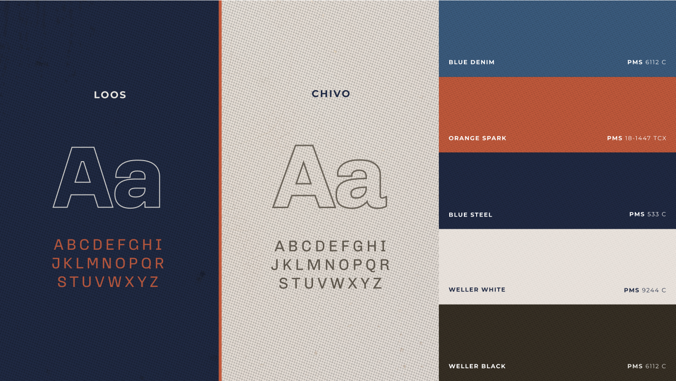
After an extensive exploration of styles and typography, the client helped us select an orange and blue option that draws inspiration from mid-century industrial brand design. This forthright, no-nonsense wordmark features geometric, sharp angles that allude to the forming, stamping and welding process in metal manufacturing and machining. Its thick monoweight stroke conveys both craftsmanship and authority.
Services
- Brand Strategy
- Logo & Identity
- Brand Guidelines
Industry
- Metal Fabrication