
Insight | 01.17.25
Insight | 06.04.26
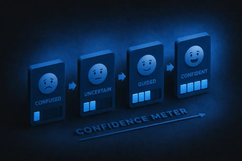
A lot of companies treat content and UX as separate disciplines: content is the words, UX is the design. And while they do require different skill sets to create, the end users experience them together. The interface guides people visually, while the content guides them mentally, helping them understand what’s happening, what to do next, and why they should trust the experience in the first place.
A strong UX/content strategy intentionally combines both. It shapes how information is organized, how users move through experiences, and how language and design work together to reduce friction and build clarity.
That strategy answers questions like:
Navigation labels, onboarding flows, forms, product descriptions, buttons, help articles, microcopy, and calls to action are all part of the same experience. A polished interface still fails if users don’t understand what’s happening.
So how can you tell when a UX/content strategy is truly working? Here are some of the clearest signs:
One of the strongest indicators of effective UX/content strategy is that users rarely have to stop and ask themselves questions like, “What does this mean?”, “Where do I go next?”, or “What am I supposed to do here?” When experiences are unclear, users feel friction immediately, even if they cannot fully explain why.
Strong strategy removes that ambiguity by delivering the right information at the right moment, in the right tone, and with the right amount of detail. Instead of feeling overwhelmed, users feel guided.
The best UX/content strategy often feels invisible. Users move through experiences naturally because instructions are clear, navigation labels make sense, buttons communicate specific actions, and information is organized logically. Most users will never consciously notice the strategy itself. They simply experience less friction.
When users feel confused or overloaded with information, they leave. Strong UX/content strategy reduces those drop-off moments by making experiences easier to understand and navigate.
That often leads to:
Sometimes even small word changes can significantly improve user confidence during key moments.
One subtle sign of improvement is the evolution of support requests. Weak UX/content strategy often creates repetitive confusion-driven questions like “How do I do this?” or “Why can’t I find this?” As clarity improves, those questions decrease.
Support conversations become more nuanced and less focused on basic navigation or comprehension issues, which usually means users are finding answers more independently.
Strong UX/content strategy changes how organizations think about content. Instead of treating words as decoration added at the end, teams begin recognizing content as part of the user experience itself.
Writers are brought into conversations earlier, UX and content decisions happen together, and product teams become more intentional about clarity. Content stops being treated as filler and starts being treated as infrastructure.
Clear communication builds trust. When content is thoughtful and well-structured, processes feel more transparent, expectations feel clearer, and decisions feel easier. Even errors feel less frustrating because users understand what happened and what to do next.
Over time, that clarity creates confidence in the overall experience.
Good UX/content strategy balances personality with clarity. Users should feel the brand’s tone without sacrificing comprehension.
That means:
The goal is not to sound impressive. The goal is to help people move forward.
When UX/content strategy improves, users spend less energy searching for what they need. They can scan pages more quickly, compare options more easily, understand priorities faster, and find answers without feeling slowed down by the experience.
That usually comes from improvements in content hierarchy, information architecture, headings and labels, content grouping, progressive disclosure, and search functionality. Good strategy respects users’ attention by organizing information in ways that reduce effort instead of increasing it.
Users should not feel like they are entering a different universe every time they switch platforms or channels. Effective UX/content strategy creates consistency across websites, apps, emails, help centers, customer support, and marketing materials.
That does not mean identical language everywhere. It means users encounter a consistent logic, tone, and structure that helps them feel oriented no matter where they interact with the brand.
At its core, UX/content strategy helps people understand, decide, and act with less friction. If users regularly feel overwhelmed or uncertain, the strategy still has gaps.
But when users feel informed, capable, guided, and confident throughout the experience, the strategy is working. Over time, that clarity becomes part of the brand experience itself.
Insight | 11.26.25

Marketers love to talk about acquisition. It’s flashy, it’s measurable, it looks good on a dashboard. But the truth? Long-term growth comes from loyalty. And loyalty doesn’t happen by accident. It’s earned, step by step. Too often, brands either rush the process or skip it entirely, then wonder why customers ghost them after one purchase.
Here’s how to avoid the one-and-done trap and build loyalty that actually lasts:
If you want someone’s information, give them a reason. We have conversations with clients about this all the time. “We don’t want them to go to Amazon, we want them to buy from us, so we should ask for their email address and phone number, and blood type, and…” Yeah, sure thing. You want someone’s information? Give them value. If it’s an e-commerce business, a purchase incentive is always an obvious one for a first-timer. Or a free gift with purchase. If it’s an item or service with a longer lead time, help them pre-solve their problems.
Give them rich content, video tutorials, downloadable step-by-step guides, etc. Give them so much valuable information that they’re practically salivating to fill out your lead form. Give real value.
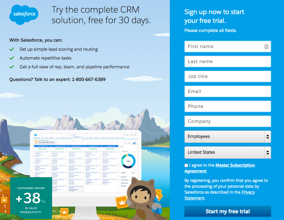
Salesforce has a great, well-known product and a great reason to fill out their lead form
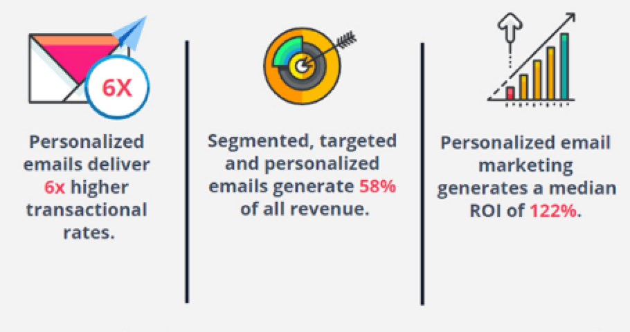
Personalization doesn’t mean blasting every buyer with the same recycled offer. If someone’s already shown you what they’re interested in, reflect that in your messaging. Respect the signals your customers give you, and use them to create experiences that feel tailored, not tone-deaf.
Let’s say you buy a men’s t-shirt from an e-commerce brand that sells both men’s and women’s apparel. You don’t want email promotions for women’s clothing—you’ve already shown you’re shopping in the men’s category. Easy enough. Now imagine you fill out a lead form to learn about a complicated piece of software to automate processes for your business. That shouldn’t trigger an immediate sales pitch. Instead, it should be an opportunity for you to receive rich content that answers common objections, shares case studies, or shows how to use the tool if you sign up for a free trial. You want to feel like the brand understands you, and you want experiences that prove it. The more granular the personalization around your specific behaviors and interests, the better.
No one wants to sit on hold, send an email into a void, or fight through a clunky return process. They want instant access through chat features or bots, DMs or call services that save your spot in line, then call you. They want easy returns and they don’t want to have to wait for their purchase to be credited either.” Make everything easy. It’s easy to hate on Amazon, but everything we just mentioned, they’ve mastered. You can jump on live chat with a real person in one or two minutes. You can get digital shipping labels for returns, and sometimes they don’t even bother with having you return the item. They have exhaustive FAQs. There is rarely a question you can’t get answered or a problem you can’t get resolved in under 5 minutes with them.
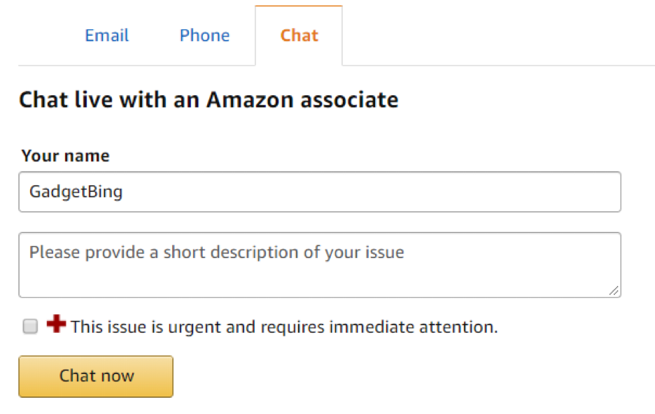
You know why Amazon is kicking everyone’s ass? Because they do things customers like. Convenience isn’t “nice to have,” it’s table stakes. Live chat, clear FAQs, instant shipping updates, seamless returns—that’s the standard now.
Buying is only the beginning. Think about the amount of times you’ve needed an answer quickly and have relied on helpful digital content to solve your problem. We’d guess it’s been more than a dozen times month over month – it definitely is for us. Tutorials, quick tips, videos, or community forums help customers feel confident in what they’ve chosen.
Many skincare brands are great at this, particularly since so many people feel insecure and unsure if they’re doing it right. Don’t allow them to feel that way if you can do something about it.
One of our clients, Dash, has seasonings that are salt-free, which is great for people who want to watch their sodium for their heart health. In news that won’t surprise you, even eager customers can get bored of just talking about the heart. So we’ve worked with them to make sure their web content speaks to the whole person – packing meals with flavor, having the power to adjust salt in their meals, finding their own personal flavor, and family-focused recipes.
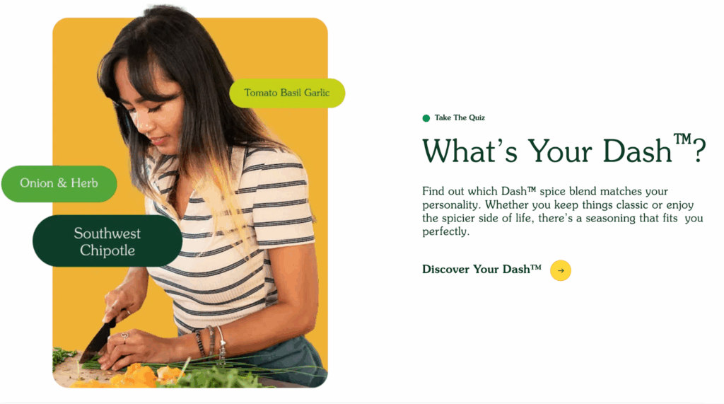
Share content that speaks to your customers’ broader interests and needs. Surprise them with stories, insights, and reasons to stay engaged beyond the transaction. Boredom is the enemy of loyalty. The more intimately you connect with your customer, the more likely they are to find reasons to stick around.
Include personalized notes in your shipping packages. Call a customer and thank them for their business. Give them early access to new product launches, or exclusive content. Ask them for their opinion or to join a focus group about new product ideas. Anyone can do these things, and most of them don’t cost a dime. But few will actually do the work. Be one of them.
This list certainly isn’t exhaustive. Loyalty programs, referral perks, and exclusive communities all add to the mix. But the point is simple: if you treat customers like one-time transactions, that’s exactly what they’ll be. If you treat them like valued partners, they’ll keep coming back.
Insight | 09.25.25

For all of the complex innovations, new channels and tech stacks in advertising, the industry’s reason for being isn’t that complicated.
It’s this — have a great product/experience with a clear value proposition, then go find your customers and delight them with the news.
It doesn’t matter how many obnoxious buzzwords you can pack into a self-indulgent LinkedIn post; if you can’t do the above, then your proprietary tech ‘whatever’ isn’t worth a damn.
Despite that simplicity, too many brands/marketers never bother to understand, at an intimate level, where their consumers spend their time, how they spend their time, and what they want from that time spent.
Hello, Customer Journey Map.
A Customer Journey Map takes all of those questions and turns them into a comprehensive understanding of how customers experience a brand. It’s critical to ensuring all advertising efforts are working in concert to hit the target. Here are some important questions to start with when building a Customer Journey Map for your brand:
In our experience, these questions generally lend themselves to five categories that belong in your Customer Journey Map:
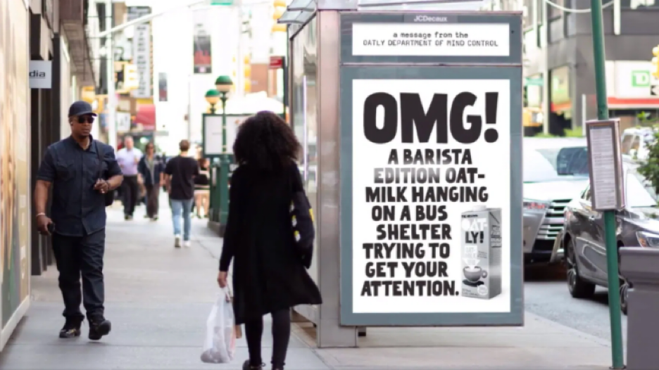
Want to talk about getting discovered? In the physical realm, few brands (recently) have done it better than Oatly.
And keep in mind that consideration is also a function of share-ability. You’d be amazed at how many sales get made on WhatsApp, Slack, G-Chat, or on-site chat features. So, yeah, embed yourself there too.
Be omnipotent (err, close to it). And think about what really gets people to consider you — can you offer a free trial? An incentive? A side-by-side comparison? A money-back guarantee? Or how about the use of Augmented Reality to try items on from a smart phone…

Warby Parker built a massively successful business on the back of the consideration phase of their business model doing just that.
Again, place messages in the context of where the user is shopping. Chances are, they’re in your store on or offline. Repeat messaging to people who’ve clicked on ads with intentional calls to action are the most common pathway to purchase. But remember — you know your customers are on multiple channels. Don’t go all in one channel just because you like the attribution data (your customer doesn’t care about your attribution).
Also, is checkout easy? Do you make it easy to add other items to the online cart, and can customers see shipping and savings costs before they have to enter their credit card information? And what happens when they land on the thank you page?
But that just scratches the surface. If you’re selling online, maybe you can’t offer two day shipping like Amazon. That doesn’t mean you can’t delight the customer while they’re waiting — give them shipping updates. Invitations to join the community of buyers they’re joining. Send them videos on how to use or style the product, or tutorials on how to get the most value out of it. Build anticipation! And what about when they open the package? The sneaker biz has nailed this — unexpected packaging and boxes with special gifts and surprise notes inside. Cards with detailed information on where to leave reviews, or hashtags to use to share the experience. Everything is an opportunity to enrich the shopping experience. And this doesn’t even begin to touch retail. Ask yourself how you can delight a customer at every point in the process. Then get to work.
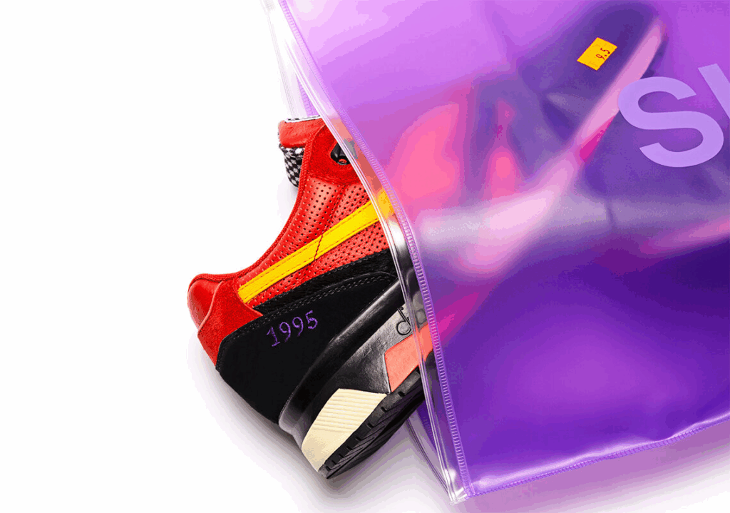
Look at these custom collaboration shoes between hip hop artist, Raekwon, and shoe brand, Diadora. The shoes come in purple sleeves. One says ‘Side A,’ the other says ‘Side B,’ a nod to the musical releases of the shoe’s heritage in the year 1995.
But no one wants to call a 1-800 number. No one wants to email a service account and wait a week for a stranger to reply. They want instant access through chat features or bots, DMs or call services that save your spot in line, then call you. They want easy returns and they don’t want to have to wait for their purchase to be credited either.
Touch points along the way include a strong FAQ section on the website, terms & conditions, digital return labels and return confirmations, and more. As a bonus, utilize YouTube for tutorial videos too.
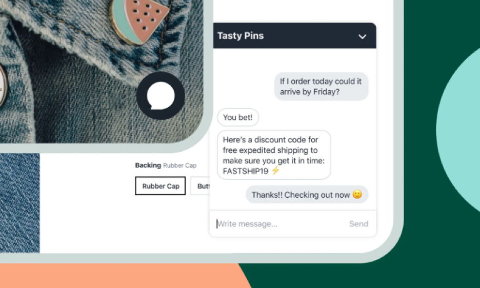
Boom. Instant access through a chat feature — and a successfully expedited return and new purchase.
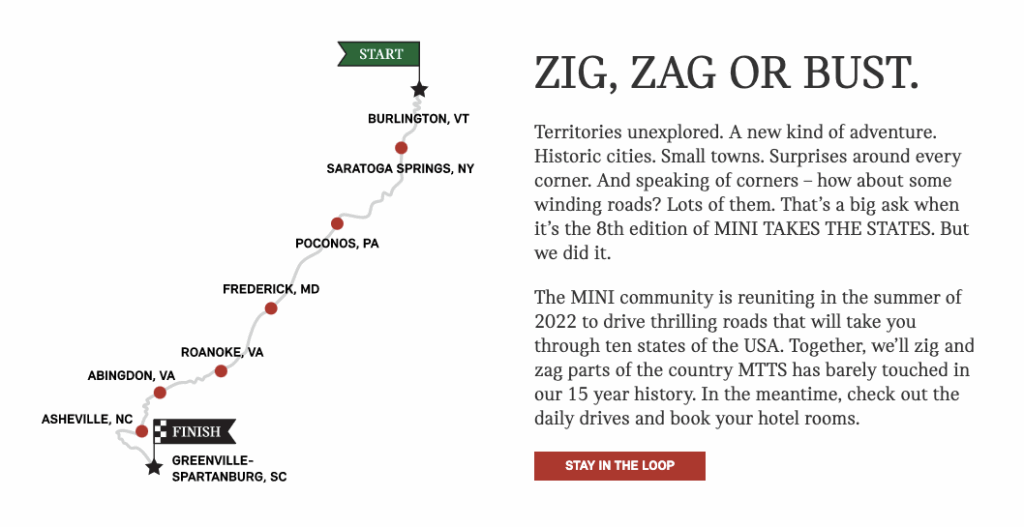
Take the case of Mini Cooper, where drivers have coordinated their own road rallies all across the country. Mini could’ve found a way to shut it down on legal terms. Instead? They embraced it and joined the fun.
Putting each of these steps together makes for a truly comprehensive customer journey map. And doing so makes it easier to put together a media plan that really speaks to the customer you want, and not just a catch-all because everyone else is doing it.
Go where your customers are. Put messages in those places. And then, delight them like it’s your job. It is.
Insight | 06.23.21
Summer is here and everyone gets excited about a road trip! This had us thinking, how does the road trip compare to your customer journey? Whether you’re driving across the country, or just to warmer weather – there’s always an attraction or scenic overlook along the way to capture the perfect road trip selfie. These pit stops add to the memories and the journey along the way. As marketers, we like to add to the journey (even the pit stop selfie) to make a brand impression, conversion or create a loyal follower.
I recently spoke at the WPEngine summit on creating a digital experience platform and making the most of your digital presence. Much like a road trip, your customers make stops along the way before they reach their destination! With new tools and technologies emerging every day, I’ve rounded up 4 of my favorite tools to use to enhance your customer’s experience and learn from their journeys:


Have another tool or tip that adds to the journey? Drop us a line, we’d love to hear about it! Did we mention that Yalo offers FullStory for digital experience intelligence that leads to deeper engagement and conversion? We just did!